Find information and products for people who are blind or have low vision. Get details on accessibility features of Canadian bank notes and how to recognize all five denominations with confidence.
Diane Bergeron and Jane Ondrik from CNIB explain the accessibility features of the new vertical $20 bank note and the importance of designing bank notes that are accessible for all Canadians.
The vertical $20 note, like all of Canada's bank notes, includes accessibility features like tactile dots and large high-contrast numbers. These features help people who are blind or partially sighted recognize the vertical $20 note with confidence.
Accessibility features
Tactile feature
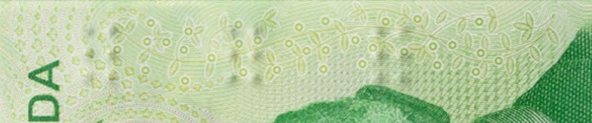
These elements are not security features and should not be used to verify that bank notes are genuine.
The tactile feature consists of symbols of six raised dots (two columns of three) separated by a smooth surface.
This system is not Braille. It was developed in consultation with Canadians who are blind or partially sighted after research indicated that not all users read Braille.
The number and position of these six-dot symbols vary according to the denomination:
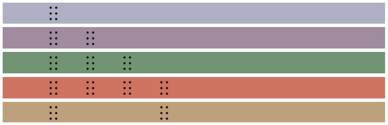
- $5 note: one six-dot symbol
- $10 note: two six-dot symbols
- $20 note: three six-dot symbols
- $50 note: four six-dot symbols
- $100 note: two six-dot symbols separated by a smooth surface that is wider than on the ten dollar note
About vertical notes
The tactile feature’s placement on the vertical $20 note and vertical $10 note is consistent with previous horizontal notes. The symbols are in the same position relative to the main security feature or large window area.
Large high-contrast numbers

Large high-contrast numbers assist people with low vision to identify bank note denominations. These numbers appear on both sides of each note: a dark number on a pale background appears on one side, and a white number on a dark background appears on the other side.
The use of reverse contrast on each side of the note is designed to accommodate different types of sight loss.
About vertical notes
Canadians with low vision who use the large numbers will need to orient the note vertically to view the denomination at the correct angle.
Vertical $20 note
- a dark 20 appears in the top left on the front of the note, and
- a white 20 appears in the top right on the back.
Vertical $10 note
- a white 10 appears in the top left on the front of the note, and
- a dark 10 appears in the top right on the back.
About current horizontal polymer notes
On polymer notes with a horizontal orientation, a dark number appears in the bottom left on the front of the notes, and a white number appears in the bottom right on the back.
Distinct colours

The distinct colours used for each denomination also assist individuals with low vision to recognize their bank notes. The colours used for each denomination are consistent across series:
- $5 note: blue
- $10 note: purple
- $20 note: green
- $50 note: red
- $100 note: brown
About vertical notes
The vertical $20 note is primarily green but has a security stripe in a contrasting purple colour. This makes it more easily identifiable as the vertical $20 note.
Commemorative notes
The Canada 150 commemorative $10 note (issued in 2017), and the $20 note (issued in 2015) have the same suite of accessibility features as all other Frontiers series polymer notes (with a horizontal orientation).
Device-assisted bank note identification
For those who use a smartphone or tablet, there are several applications that can be used to denominate bank notes. The Bank of Canada has evaluated Seeing AI, which quickly and reliably denominates Canadian notes.
To learn about other apps that are popular with people who are blind, Deafblind or have low vision, contact CNIB.
Bank note readers
Bank note readers identify denominations through machine readable codes. Frontiers series polymer notes (with a horizontal orientation) can be read from both short edges of the note, while older Canadian Journey paper notes can be read only on the left edge (when the side with the large portrait is facing up).
The bank note reader was discontinued in 2018, but those with a device can continue to use it. It is compatible with Frontiers series and older paper notes only.
Seeing beyond vision loss

Materials to download
The following materials explain how Canadians who are blind or partially sighted can determine the denominations of bank notes.
Bank note accessibility feature overview - electronic Braille
For Braille transcription services of the Bank note accessibility feature overview, consult CNIB Beyond Print.
You can also call our toll-free line to hear a recording at 1‑800‑303‑1282.